
![]() ’ll
keep it simple. What we’ve done here, spinewise, bindingwise, is an adaptation
of a quick-fix restoration technique for old paperback and perfect-bound
books taught to me by Robert Marshall of Harvard Book and Bindery (5 John
F. Kennedy Street, Cambridge, MA 02138). The second-floor window of his
shop says simply: Rare Books, and the door inside says, in addition to
all kinds of other stuff: Restoration. A short, stocky man with two inches
of fat cigar poking from the corner of his mouth, he stepped from the
back room to say hello while I was looking around in his tiny shop, and
pointed to some books. I asked to see the press. His tiny eyes behind
thick rectangular glasses crinkled excitedly and he threw open the door,
waving for me to follow. He immediately threw an ancient bible at me,
“Damn thing’s indestructible, it’s on its fifth cover, one every hundred
years or so…” He didn’t know who would cover it next time, he’s hoping
maybe someone like me, though not me, since his cover’s going to outlive
us both. He kept throwing book after book at me, and I finally—shyly—pulled
one of my own from my bag and handed it to him[2].
He relit his cigar and turned away from me, chuckling. I don’t know, but
maybe he was giggling. He said it was “Cute.” I tried to explain how I’d
used the post-screws to do a sort of Japanese binding thing, rather than
the usual post-bound end-product, and he said “Yeah, yeah,” and took my
arm and brought me to the lying-in press. He grabbed a paperback book
and told me to break its spine. So I did. He took it back and said that
if I ever ran across something like this, here’s what I would do to get
it back in shape. He peeled the paper away from the spine (with a razor),
put it in the press with about ½ an inch exposed and then cut into it
perpendicularly with a hacksaw. He cut only four times (
’ll
keep it simple. What we’ve done here, spinewise, bindingwise, is an adaptation
of a quick-fix restoration technique for old paperback and perfect-bound
books taught to me by Robert Marshall of Harvard Book and Bindery (5 John
F. Kennedy Street, Cambridge, MA 02138). The second-floor window of his
shop says simply: Rare Books, and the door inside says, in addition to
all kinds of other stuff: Restoration. A short, stocky man with two inches
of fat cigar poking from the corner of his mouth, he stepped from the
back room to say hello while I was looking around in his tiny shop, and
pointed to some books. I asked to see the press. His tiny eyes behind
thick rectangular glasses crinkled excitedly and he threw open the door,
waving for me to follow. He immediately threw an ancient bible at me,
“Damn thing’s indestructible, it’s on its fifth cover, one every hundred
years or so…” He didn’t know who would cover it next time, he’s hoping
maybe someone like me, though not me, since his cover’s going to outlive
us both. He kept throwing book after book at me, and I finally—shyly—pulled
one of my own from my bag and handed it to him[2].
He relit his cigar and turned away from me, chuckling. I don’t know, but
maybe he was giggling. He said it was “Cute.” I tried to explain how I’d
used the post-screws to do a sort of Japanese binding thing, rather than
the usual post-bound end-product, and he said “Yeah, yeah,” and took my
arm and brought me to the lying-in press. He grabbed a paperback book
and told me to break its spine. So I did. He took it back and said that
if I ever ran across something like this, here’s what I would do to get
it back in shape. He peeled the paper away from the spine (with a razor),
put it in the press with about ½ an inch exposed and then cut into it
perpendicularly with a hacksaw. He cut only four times (we’ve more
than doubled that, though he showed me it was unnecessary except for aesthetic
reasons I opted for six cuts originally, but have since decided more
is better, especially for aesthetic reasons), then  laid cords into
each cut, covering the spine and cords with a layer of PVA. “That’s pretty
much indestructible too, under normal circumstances, once it’s dry,” he
said, and then pulled another paperback from the table and handed it to
me. He’d done the same thing on this one, but it was dry and I did find
it to be much stronger than I thought it would be, stronger than the original.
I was able finally to tear it apart, but I had to pull one side with both
hands while stepping on the other. He’d cut much deeper into that one
than we have with spork. So that’s what we’ve done here.
laid cords into
each cut, covering the spine and cords with a layer of PVA. “That’s pretty
much indestructible too, under normal circumstances, once it’s dry,” he
said, and then pulled another paperback from the table and handed it to
me. He’d done the same thing on this one, but it was dry and I did find
it to be much stronger than I thought it would be, stronger than the original.
I was able finally to tear it apart, but I had to pull one side with both
hands while stepping on the other. He’d cut much deeper into that one
than we have with spork. So that’s what we’ve done here. We’ve
printed in signatures of 16 pages, we’ve printed in signatures
of 12 pages,[3] gathered
and folded them, we’ve laid them out to print in stacks to be cut
and stacked again (the official terminology is ‘cut stacks’), then acted
like they were busted paperbacks. This is, of course, an accepted binding
method, but I prefer to think of it, and this project, in restorative
terms[4].
For the cover, we decided to use primed
canvas[5]. Like for painting.
The prototypes were stenciled, badly, the canvas cut from a painting I
never got around to finishing. The final product was silkscreened, a method
which, at the time of this writing, I have no clue about, and many thanks
to Johnny, who does have a clue[6]. And thanks as well to Chris, coming
through at the 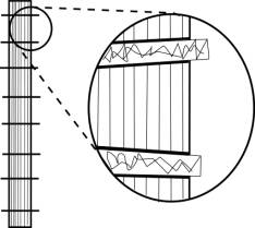 last minute when
everyone was broke and we were wondering what kind of physics we had to
bastardize and wreck to make not enough into too much. See, we’ve got
these rules, we’ve got a way we’re going about things—I’ll deal with that
in a second.
last minute when
everyone was broke and we were wondering what kind of physics we had to
bastardize and wreck to make not enough into too much. See, we’ve got
these rules, we’ve got a way we’re going about things—I’ll deal with that
in a second. We left an inch on all sides for folding under (inside),
using the edge of the print as a guide. I screwed up somewhere in
the measuring department and somehow made the cover images simultaneously
one-quarter inch too narrow and one-half inch too tall, so we made us
a template the right size and traced around it so my wife and I would
know where to fold[6],[7]. Each corner was cut at a 45 degree angle so we could miter
them, and then with the aid of some glue and a hot iron, we got them into
shape.
When it finally came around to getting the
text block into the cover, I stumbled on the spine. I wanted it flat,
but the canvas insisted on coming out curved no matter what I did. So,
to solve this (and God, I hope I actually do this—this has to be written
before they can be bound, so I’m doing all this strange tense-ing, back
and forth, past and future—I thought about acting like it was all past,
but it’s not, so I’m not going to pretend. Well, not much), I attached
a strip of thin bookboard to the spine of the text block inside
of the canvas, creating a perfectly flat surface that would not be compressed
as the pages would. More thanks here, more last minute kickdowns and rescues.
This one by Chiara, coming through with the machines which was almost
a violation of the rules, but it all worked out in the end. This I
attached to the canvas, pulling the cover around and attaching it to the
sides of the text block as well. The last step was to simply throw
all kinds of glue all over the inside of the cover near and on the spine,
then push the text block flat against the bookboard and press the sides
to the sides. This makes for some awkwardness when opening, as you might
want to pull on that first page, but it’s really only there as an anchor.
This begs the question, why not just glue the entire page then? And that’s
because I didn’t want to have to press the books, I wanted them constructed
and finished. I hate the anticlimax of putting it in the press after hours
or days or even weeks of work. You don’t know what’s going to happen,
you don’t know how it’s going to come out, if you’ve done everything perfectly
until it’s almost too late. I mean, have you ever had to backtrack while
constructing a book? It’s so much easier to just start all over again.
This is probably why I’m still so nervous about actually restoring books.
Already I have ideas about how to improve
the binding, but I’m stuck with this method for at least the first volume.
I’ll be making slight alterations as we go, nothing visible
from the outside, and I’ll keep you informed.
As for the rules, they’re really simple.
spork exists because of a collective desire that it be so, and
wants only that it be allowed to continue, pure and unsullied by base
materialism. spork’s a hard master to serve, but… All right, so
those aren’t really the rules. But there’s a basic idea hinting itself
there; I don’t want to go into it right now, I’ll save it and wax and
wax and wax…
[1] Revised. Oh, how it’s revised.
[2] The book I showed Mr. Marshall was the book Timothy referred to in his note. It is true that it was horrible, and it is true that I steal them and destroy them when I find them. What is not true—any more—is that Timothy has his copy. Don’t mess with me, Mister Hayek. The one I showed to Robert was one of four I bound in stainless steel (kickplate from an elementary school bathroom door—how freaking appropriate is that?), lined with blue twill. The binding and presentation were nice, and I’ve been incorporating more and more metal into books since then. If things go right, one future volume of spork will be bound in metal, but that’s way off yet—but if you’re with me on it, if you think it would rock like I think it would rock, then let the rest of the crew know so I can get the go-ahead. We can shoot for two years from now, for Volume Three.
[3] I found that when I did the imposition with 16 pages per signature, I ended up with about 12 blank pages at the end. I can’t afford to waste that much space, or paper. I only sacrificed a couple of pages with the 12 page imposition. But so what, you know, since I’ve abandoned even that for another method that involves no gathering or folding. It was a really tough decision to abandon the folding of the signatures—I’m really into the idea of the signatures in themselves, before they get folded, when they’re just sheets, because the linearity, depending on what part of the signature you’re in, gets all screwy, almost nonexistent at the beginning… but this in itself is part of why I had to abandon the signatures: I made a couple of slips, took too many pages for one signature and not enough for another and screwed the linearity for people who don’t really see it quite like I do, like me, the guy against linearity—but eventually, when people were showing me the books with page 81 preceding 63, I had to make that supertough call. Another reason was that with the folded pages I had to make deeper cuts into the spine than I had anticipated, to be certain that all pages were adequately reinforced and anchored, which interfered with how well the book opened—and while people do not expect a paperback book to open completely, to lie flat, there seems to be a tendency among people, when they hear a book was made by hand, to try to pull it apart, as though through that destruction they can (most often unintentionally) somehow prove the superiority of the machine-made product which they did not try to tear apart (this is not a defensive pose, this is more a request to please be at least as kind to these as you would to any other book; if you tear books apart on a regular basis, well, that’s your business, but otherwise… please be reasonably gentle).
[4] And while I’m still thinking restoratively, the method we’re using is actually called Perfect Binding. Though it is anything but. What one would do if Perfect Binding was the order of the day would be to start out like I did originally, that is, gathering and folding the signatures, then the spine would be shaved off, leaving just the stack of sheets to be bound. To that glue would be applied and then the cover wrapped around the text block. Our imPerfect method doesn’t bother with the folding and shaving (why add a step when you can just start at point B?) and further reinforces the blocks with the abovementioned cutting and cording.
[5] The initial reason for this was because I was thinking of it like a painting, over and over, painting after painting. After printing just a few of them for the first run, we realized that it simply wasn’t working out, the screening inks weren’t drying quickly enough and so the canvases were sticking to the screens when we laid the next color down. So we flipped them over. The now-obverse, unprimed side absorbed the inks and let us pretend like we were making good time—which we weren’t, not by any means; we’d screwed so many things up and measured so many things wrong, took so long to decide just what shade was proper for what—and we ended up with undiluted, straight-out-of-the-bucket colors; we discussed and argued about shades and degrees, getting all pissed off at each other: this one was just too this and that one wasn’t enough that, etc. etc. etc., and I’m embarrassed how stupid I got, how many fruity poses I struck, how I stamped my little feet (forgetting that I’m 6’3” and my feet aren’t little), and I wasn’t alone, we were all at each other—and then the buckets loomed luminous before us and we gasped. “What’s that?” we asked in unison. That’s Blue, Johnny informed us. “And that?” we pointed at another bucket, all giddy and epiphanous. That’s Orange. See, the reason this is really sad is that we decided initially on blue and orange, then spent two hours fighting about it only to end up right where we started. So now it’s still important that we use the primed canvas, but the reason is different. The gessoed side makes for even folding, nice creases and a whole lot better workability in general, as long as the gesso is on the inside. The few printed on the primed side were hell to fold, they got all wrinkly and strange and necessitated a press (did I mention that the whole point of this method is to avoid pressing the books?). I tried to work with plain canvas, but no matter how tight the weave or dense the fabric—and I mean different things, I know they sound the same, but I’m kind of short on words right now and suddenly I’ve got another deadline because the first 100 sold more quickly than I thought they would—I just couldn’t make it work. The canvas was too flimsy even after too much starch (which, by the way isn’t good for fabric anyway, over time those starched fibers will break and the fabric will get all fuzzy) and wouldn’t hold a crease and so I ended up with all these irregularly shaped things trying so hard to resemble the rectangles I needed.
[6] Run two I printed myself. Johnny got me set up, and I fixed my earlier errors and came within an eighth of an inch of just right, while sacrificing some precision on the lining-up of the r and k in spork (word, not journal)—but, being soup, and this time me the only cook, I decided Good Enough. I had a hard time getting a feel for it, the pulling (and did you notice the lack of orange and yellow? That’s me, that’s me saying No More of this Too Much, and also me saying, I want the first run to be really special. So it is. This here, this version, God willing, is spork in truth, in toto. Elegant, simple: these are our mantras—or they would be if we were mantra-having kinds of people. This is a more complete expression of the spork aesthetic. That’s all I’m saying), the pulling of the different densities requiring different touches. I was able, after a while, to let go and let the method work the way it was supposed to, I stopped applying monstrous pressure, stopped trying to make it fit my flawed expectations, and we then started seeing not too much nor too little detail, but the kind to make the baby proud (bear, not cover). I had a whole lot of trouble with the blue. But I did it. I had my hands on every single part of every single book, and I can’t tell you how important that is to me, and I won’t go into just how intimate the concept seems to me right now, talking about it. It would seem almost masturbatory, or at least ungentlemanly, to say more.
[7] There were other hands in this here pot, but, soup that it is, I’m going to take the fall, since it’s my name on this section.